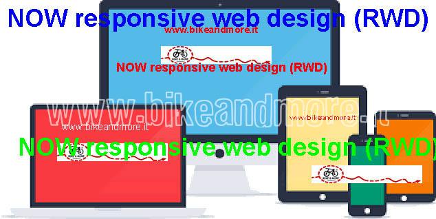
The website of Bike & More becomes more mobile friendly as it has now a "Responsive web design" (RWD); it´s an approach to web design aimed at crafting sites to provide an optimal viewing and interaction experience—easy reading and navigation with a minimum of resizing, panning, and scrolling—across a wide range of devices (from desktop computer monitors to mobile phones). A site designed with RWD adapts the layout to the viewing environment by using fluid, proportion-based grids, flexible images] and CSS3 media queries. Responsive web design is becoming more important as the amount of mobile traffic now accounts for more than half of total internet traffic.
Have a nice time!